- Tifu Kelison
- Posts
- Make Better Slides: Carousel Guide
Make Better Slides: Carousel Guide
Tifu Kelison Tifu
October 16, 2023
Carousels are a thing of psychology.
You want to keep the reader sliding till the end. It’s only a psychological factor that triggers this to happen.
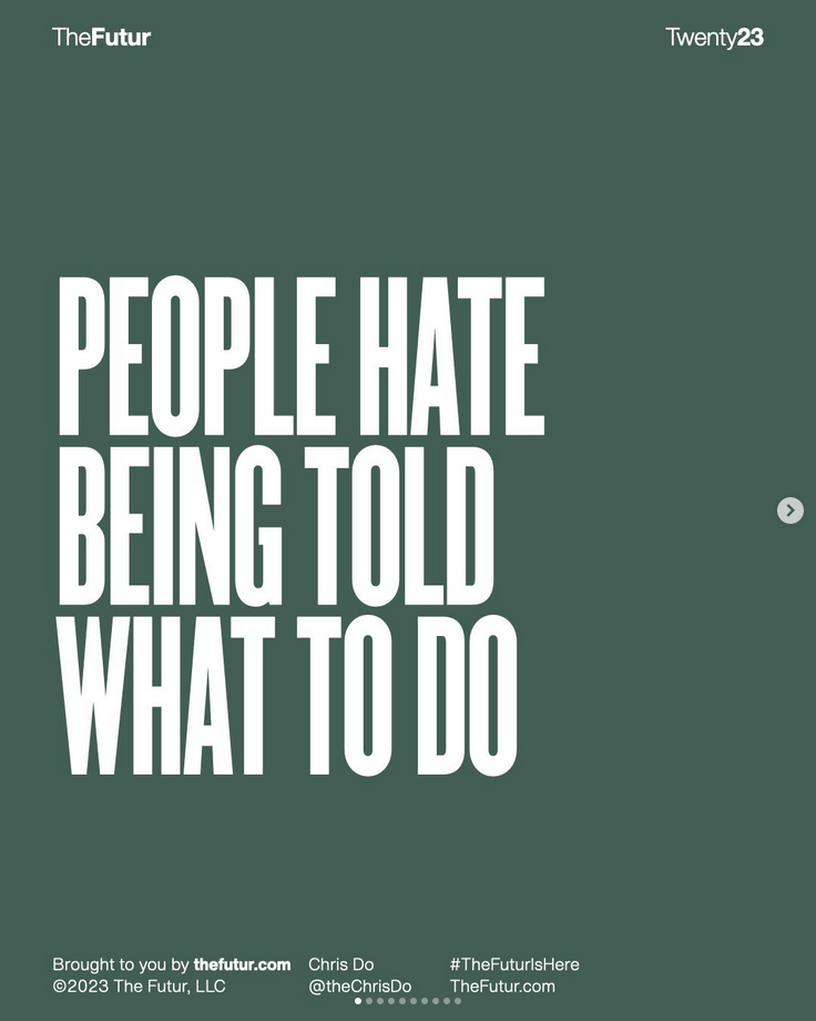
Let’s take an example, Chris Do. His carousels start with a strong hook.

People hate being told what to do.
Your audience needs to know why they should slide and platforms nowadays, well, reward you for engagement not even likes anymore.
His hooks are very strong, and the typeface he uses is very elegant and clear. The mind can read that in like a second, so that’s what you’d want for your audience.
You can choose to go clickbait style but know that if you don’t do exactly what your clickbait title says, you lose trust and even risk some people blocking you.
Now, let’s examine two carousels, one good and the other not so good.
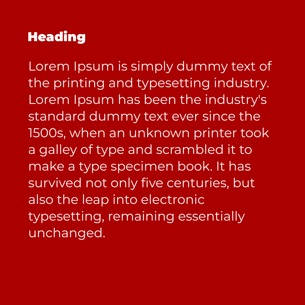
[Image Bad Carousel]
I bet you didn’t even read all that text. That’s the power of trying to fit everything in one slide. It just doesn’t help you at all.
If you wanted to do that, you’d go a little something like this:
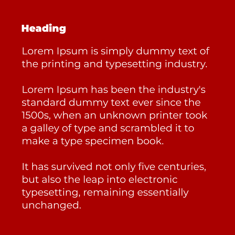
[Image: A little bit better Carousel]
Now while that’s not perfect, it allows room to breathe and for your reader to settle down and read instead of scrolling away.
Now for the one that’d get the most attention, it probably is this one:
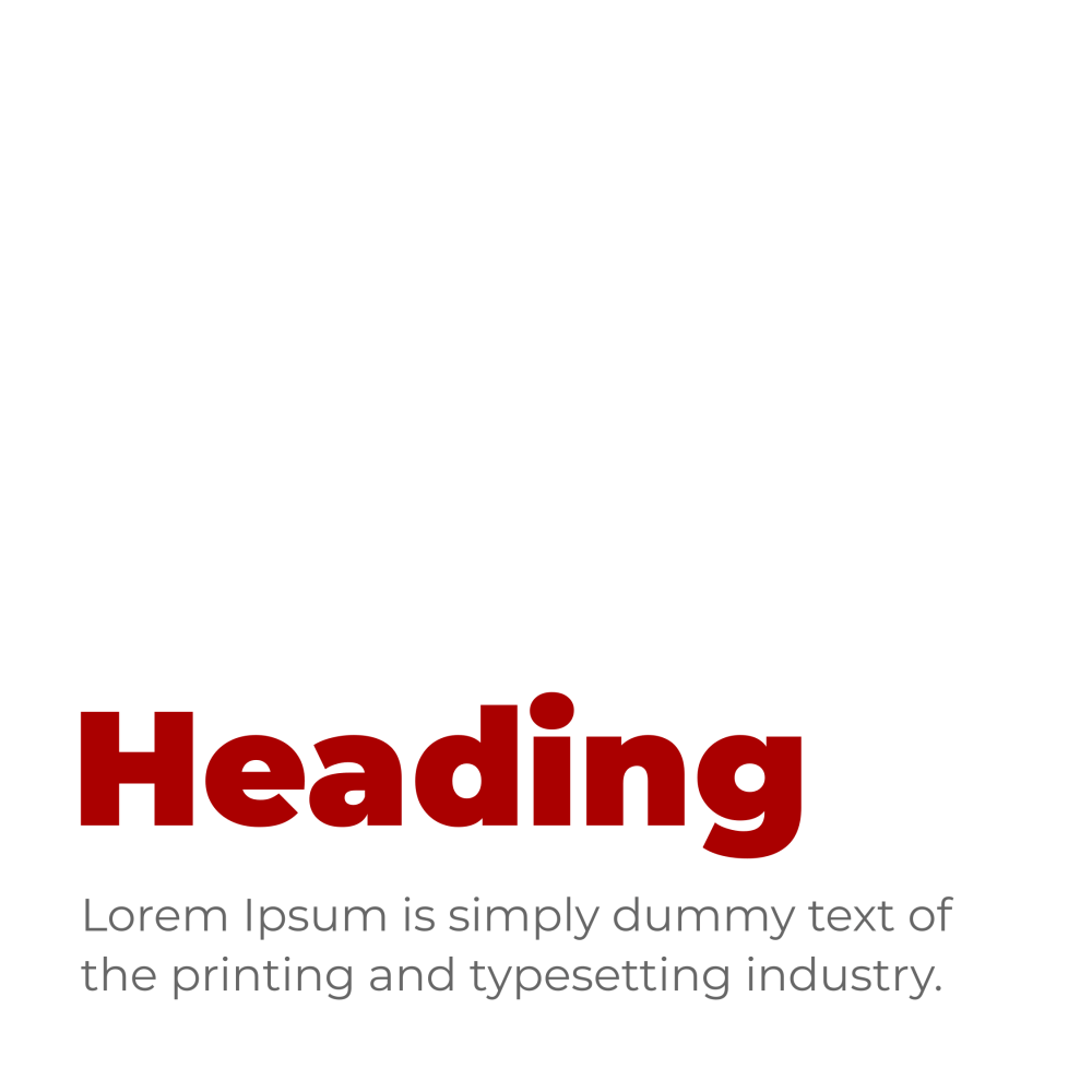
[Image Good Carousel]
The header section is bold and attention-grabbing.
Let’s dive into how to make your carousels better.
Getting a brand identity is the shortest way to summarize what I'm about to tell you because what I’ll be sharing with you are the components of a brand identity.
I feel like I need to say this first.
Developing a brand strategy before going into design creates a focus for your messaging.
If you’re on your own, it might be hard to develop a brand strategy for yourself.
It is important to develop a brand strategy because it is what informs designers on the design decisions that they make so that it can carry your message.
For example, if you go to a designer, once you just tell him/her what it’s for, and the necessary information to be used, they're off to go design.
My guess is it'll just be a beautiful design and it’ll be just that. A design without strategy is just a design with no message or concept.
So they would need to have a chat with you and figure out what you really want(like your goals for the design and in general).
Then he/she will craft a design that puts a focus on your message. It’s the same for carousels and since you’ll be using them for a very long time, it’s best to get this done now.
This is why you can get to us(well, me - Tifu Kelison) and book a consultation call.
To design a carousel, you need the following:
- Logo
- Color Palette
- Typography
- Design Assets
To make your carousels more professional and eye-catching, add little details to add more emphasis to the message.
[Good Design with details]
Look at every creator that you follow that has a massive following, you'd notice that they got their brand identity early.
This is just one of the reasons you should invest in a brand identity. You get to make your audience engage more with your content because they'd recognize you anywhere.
That's being consistent in your brand identity. Though consistency is not a "must" because it sometimes limits creativity, just do you!
Here's what I have to say about creating awesome carousels.
Cause Intrigue
Carousel design is about causing intrigue, creating an "I-must-see-this" sentence in your viewers' subconscious.
While this is not about how to write strong hooks, this is certainly about how to make your carousels better.
How many slides?
I'd normally say keep your carousel within 10 - 15 slides, but LinkedIn proved me wrong.
Include as many slides as you want or think you need, just don't bore the viewer out leaving it halfway.
One Big Goal
For each carousel that you design, have one goal for it. I have an ebook I co-created with Kinlo Ephriam Tangiri, about writing better AI prompts.
If I want to promote this ebook, I will start with a carousel post with a headline like "65% of you are using AI all wrong!"
Then at the end, I reveal the ebook.
The goal of the post was to get more sales on the ebook. That's something you'd want to check out - here.
Clear CTA
I've assumed and I tell you that it's not a good thing to do in marketing. Tell them what you want them to do in a way that doesn't disrespect or sound commanding.
This is what I use to create carousels that drive engagement.
If any of this helps you, comment below!
Reply